EcoConnect
By combining structured reflection with relevant quantitative data collection, EcoConnect seeks to increase learning and accomplishment in and outside the classroom.
Structured reflection is a powerful learning tool that enhances understanding and personal growth. Individuals analyze experiences, connect theory to practice, and develop metacognitive skills by pausing to reflect. This process reinforces learning, helps assess progress, identifies improvement areas, and sets future goals. Through structured reflection, individuals deepen their understanding, leading to better knowledge retention and application in various contexts.
EcoConnect incorporates quantitative metrics into structured reflection to enhance learning by providing clear, measurable indicators of an individual's progress and growth. Integrating the inward-looking aspects of journal-based reflection with data-driven insights enables individuals to set and track specific goals, monitor their development, and make more informed decisions about their learning strategies. This data can help to demystify areas that might otherwise feel vague or subjective, such as improvement in skills, time management, or mastery of course concepts.
Learning Objective-Based Assessments
EcoConnect adopts a Learning Objective framework to coordinate and encapsulate qualitative and quantitative assessment axes around a single module. This encourages holistic growth by providing a structured pathway to learning that is applicable both within and outside the classroom. In a Backward Design framework, a course consists of one or more course-level learning objectives (CLOs). A CLO guides the planning process by establishing desired outcomes first so that all instructional activities, assessments, and materials can be purposefully aligned to support students in achieving those outcomes. The assessment axes provide measurable evidence of students' progress toward the stated CLOs, which can be formative or summative and are designed to align closely with the skills, knowledge, and competencies outlined in the objectives. This allows the instructor to ensure that each instance in which an assessment axis is evaluated reflects the specific abilities students are expected to demonstrate.
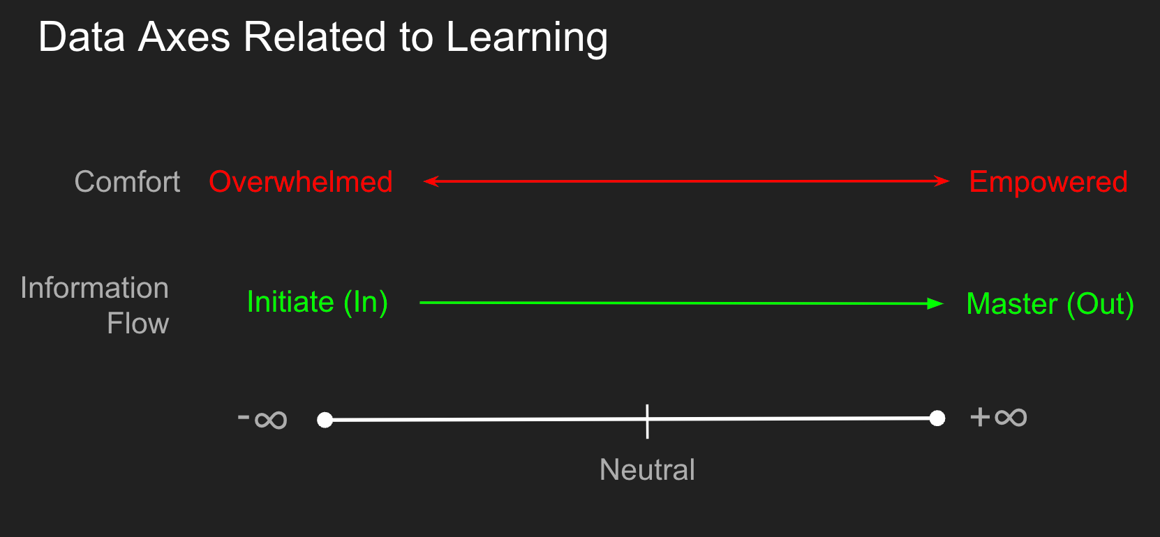
Consider the following graphic that shows two such axes:
- Student's comfort with a specific topic that ranges from Overwhelmed (negative) to Empowered (Positive),
- A measure of the net movement of topic-related information from In where an individual takes in domain-specific content, to the other extreme Out where the learning content is applied outside the specific course domain.
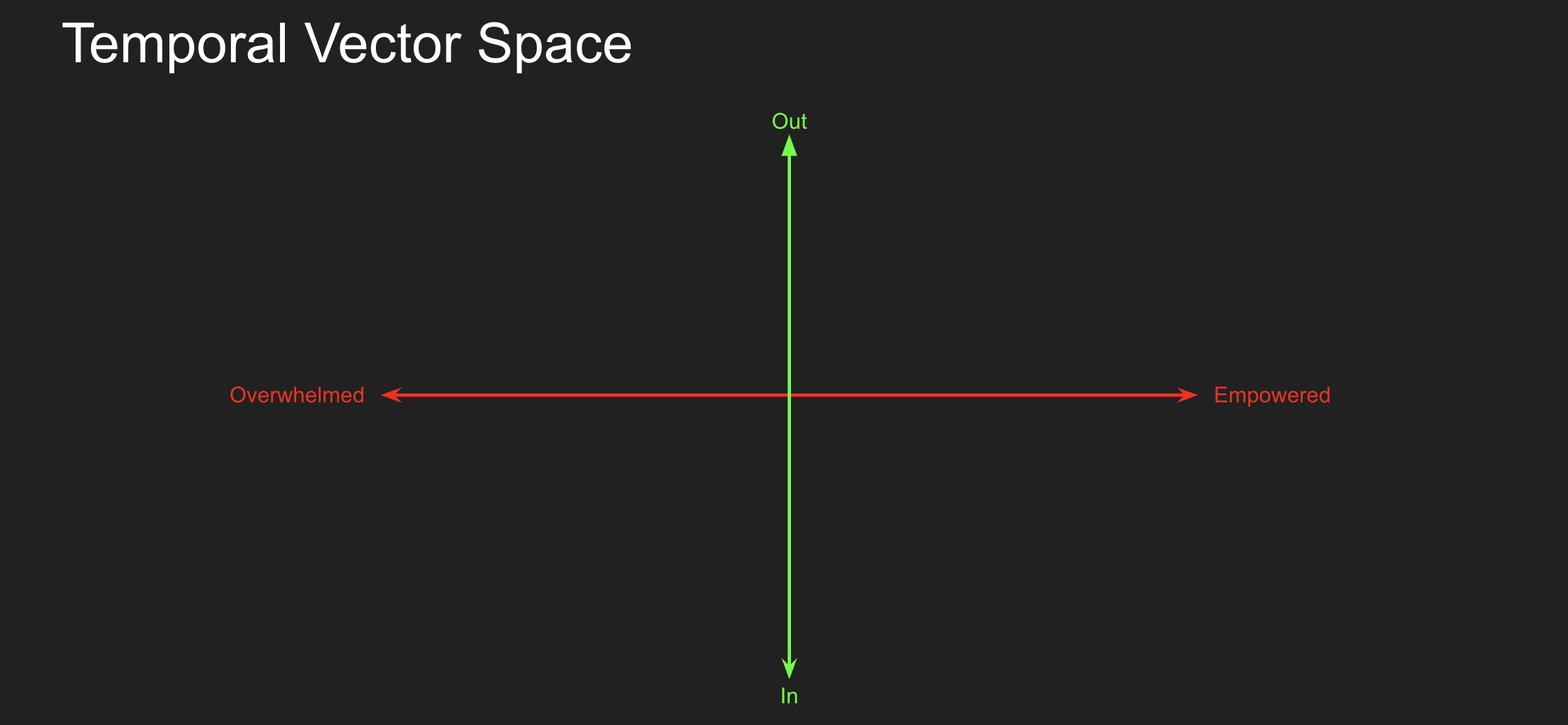
In this simple model, we can combine these orthogonal axes to visualize an individual's temporal progression in this space. As we progress through the learning experience, we intend that individuals will progress "Up and To The Right." If we take the notion that we evaluate before the start of class and after the class is done, then this should be true if we are good educators.
However, it is not always that easy. Each tool we use in instruction and assessment may impact an individual's position in this vector space differently. Here is an example shared in the quantitative courses I teach.
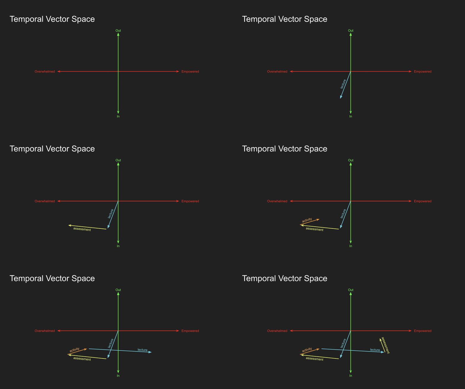
Let me go through the stages and point out a few things:
- The initial lecture has a net flow In (lecture content to student) as the participant gains insights they did not appreciate.
- The first assessment reveals that the individual was on Dunning-Kruger's "Peak of Ignorance." Students may be overconfident in their abilities relative to their actual ability, and this is commonly the first assessment that reveals this and accelerates their sense of being overwhelmed.
- Subsequent teaching and assessment items in the course move this individual in the general direction of "Up and To The Right."
Some exciting things to observe here are that a particular teaching technique (lecture in the example above) or assessment tool has differential consequences based on the student's location and deployment. You could have an excellent assessment tool, but if it is deployed at the beginning of the course, it may not achieve the movement you intended. I'm not suggesting that we banish our more refined and practical instructional tools from the start of the course. Still, it is a fascinating option to consider quantifying the "vector deviance" in these axes during the learning process.
This led me to start down the path that led to the development of EcoConnect.
FOTJ
In collaboration with some of the most talented faculty at VCU, last year I developed an application for Footprints on the James, a scientific expedition to Advance and share Knowledge About our Watershed run by faculty from the Center for Environmental Studies and the Department of Biology.
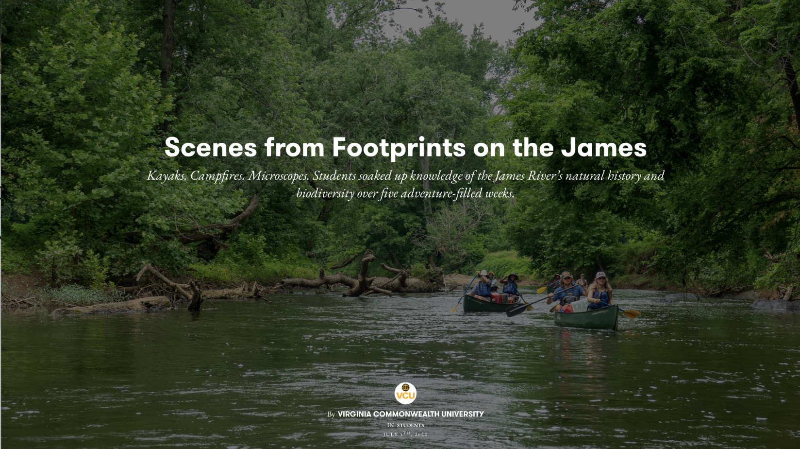
This is a "Coordinated Studies Program" (CSP) that thematically links courses taught by multiple faculty members, and the participants take the CSP as if it were one monolithic course. See Tinto & Russo for more information on this approach. I was first exposed to this technique at Seattle Central Community College back in 1990 when I was pursuing my Associate Degree. It is a fantastic blended experience for the students and faculty but a nightmare for "Records & Registration" and "Classroom Scheduling" personnel, which is probably why it is not more commonly deployed. It leads one to ask, "Who drives (or puts a governor on) the deployment of innovative teaching and learning at universities?" As an aside, though entirely related, I heard Jillian Kinzie ask the question, "What would an institution look like if students really mattered?" last week at the Assessment Institute plenary lecture—I'm a Kinzie fanboy.
This past year, the Footprints CSP combined:
- BIOL 391: The Human and Natural History of the James River Watershed
- ENVS 491: Fisheries Field Methods
- ENVS 491: BioBlitz-James River.
Dr. James Vonesh and I were interested in exploring the notion of STEM Field courses and how we can help develop the following traits (consider these the axes as described above):
- Belonging: A self-reported metric quantifying the sense of being accepted and included within the group, fostering a feeling of shared identity and mutual support
- Participation: The active involvement of each team member in group activities and decision-making processes, contributing their unique skills and perspectives to achieve common goals.
- Teamwork: The collaborative effort of a group to achieve a common goal or complete a task most effectively and efficiently, often involving a division of functions and mutual support.
In particular, we were interested in taking quantitative measurements on these axes and providing a system for structured reflection that can incorporate some linguistic analysis. I developed FOTJ (currently in the Apple AppStore and a discussion on my site here), which merged reflective writing and the ability to collect quantitative assessments throughout the expedition.
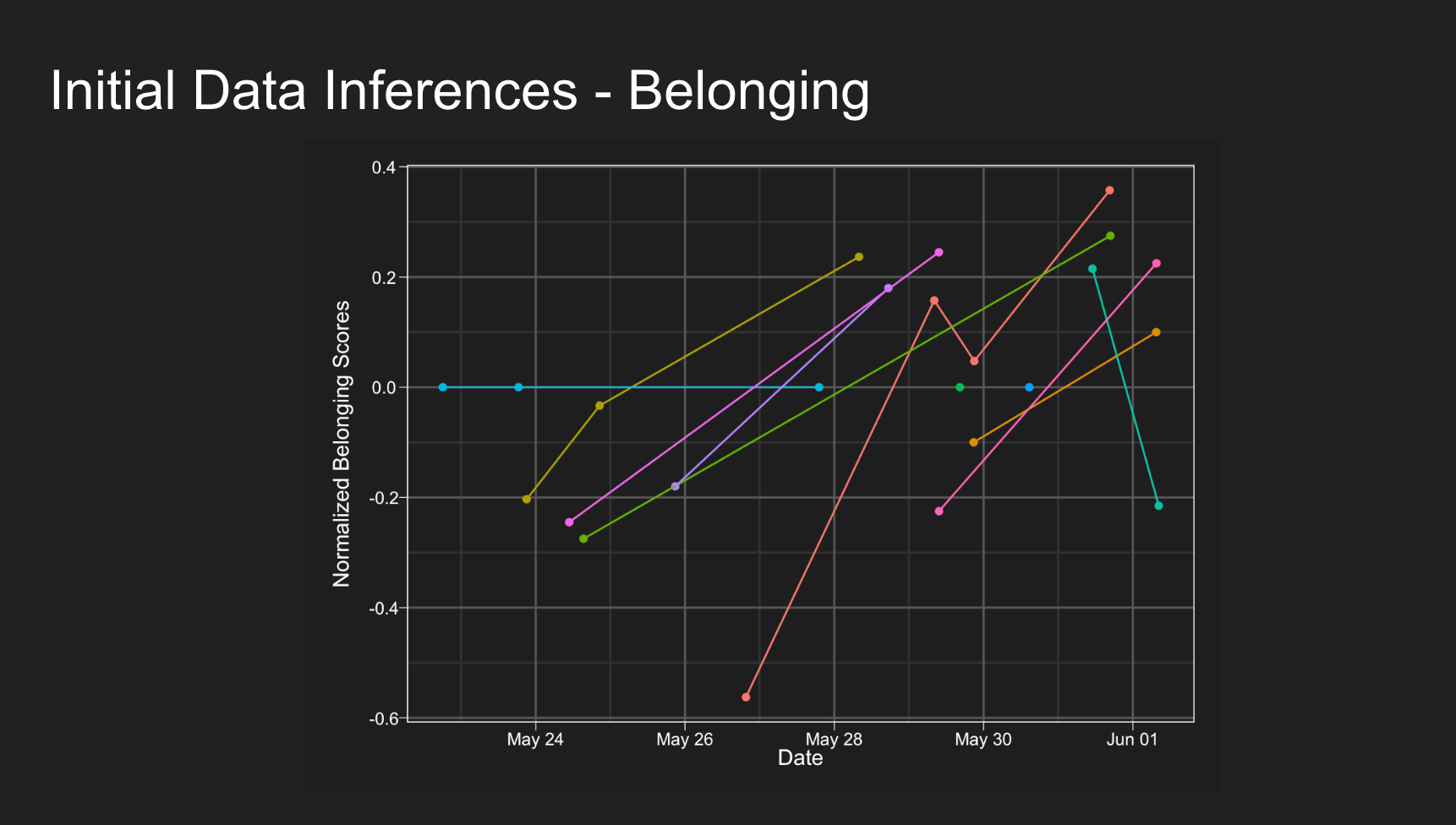
The entire dataset has been presented at a few meetings, and an upcoming publication will discuss it in more detail. We generally see the “p and To The Right” movement for individuals over time.
However, this application is specific to the FOTJ Learning Objective of developing more specific tools that support STEM Field Studies students. I want to generalize it to allow this tool to be used in various learning (or growth) situations—inside the classroom and in life.
EcoConnect
The EcoConnect app is almost ready for testing outside my research collaborators. However, I wanted to give some context as we approach beta testing.
The FOTJ app is simply a single Learning Objective (or module) with three quantitative axes (Belonging, Participation, and Teamwork), a categorical axis (Journal vs. Activity), and an associated reflective journal component. If we generalize this, we can see that assessment axes may be categorized into the following data types:
- Binary: Yes/No responses.
- Likert: On a scale of 1 to 5.
- Count: Integer response.
- Percentage: Values in the range of 0 - 1.
- Divergent: Opposing values from -♾️ to ♾️ (the axes above are divergent).
- Text: Free-form or structured reflection.
- Image/Video: Both images and video.
A Learning Objective can be created for course or personal goals and supported by adding one or more axes using the above data types.
Version 0.0.1
So, this is the first useable version of the application, demonstrating an Objective with data points and another new one that has yet to be evaluated. It is currently on iOS and iPadOS (iPads are a standard tool for field data collection). Here are some screenshots.
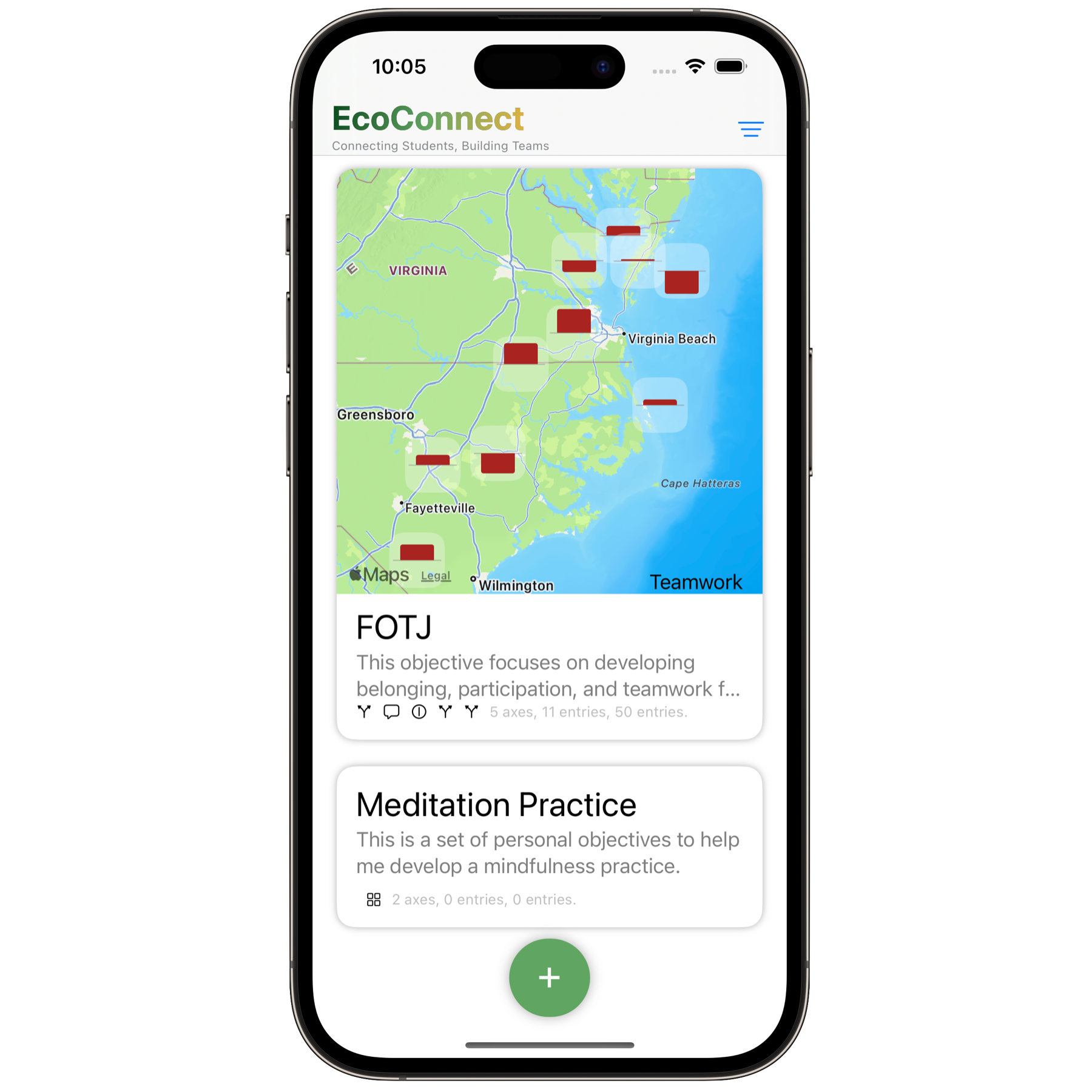
The main interface is learning objective-centric, and the cover imagery may be maps of collected data, temporal plots of data, images, or video.

Within each Learning Objective, entries are presented in reverse chronological order. Here, we see the example of FOTJ data (I use journal entries from DaDarwin's Voyage of the Beagle as an example of reflective writing data). The general entry view summarizes divergent data (the horizontal axis), binary data (Journal vs. Activity as an open/closed circle), and text input with linguistic sentiment analysis. Objectives may also include location data with each entry and weather conditions at the time of submission. I also added the option to have Image and Video treated as their own entry here as they may contribute to a 'deliverable' object for learning outcomes that are separate from the reflective writing and quantitative metrics.
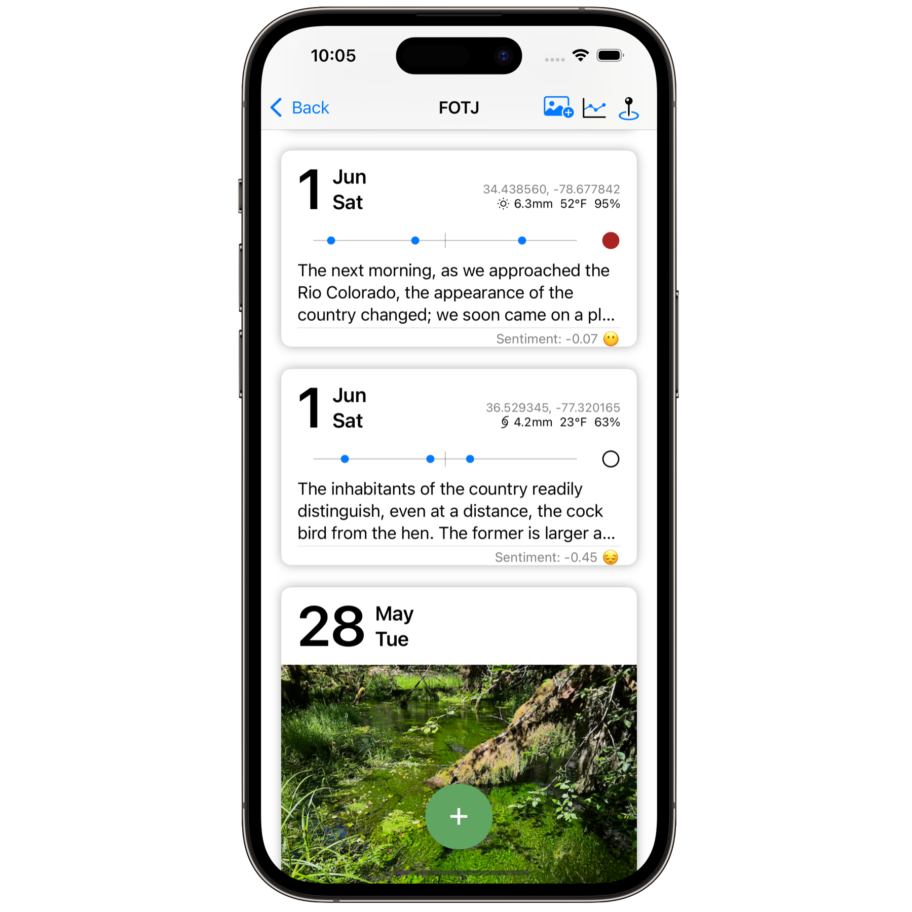
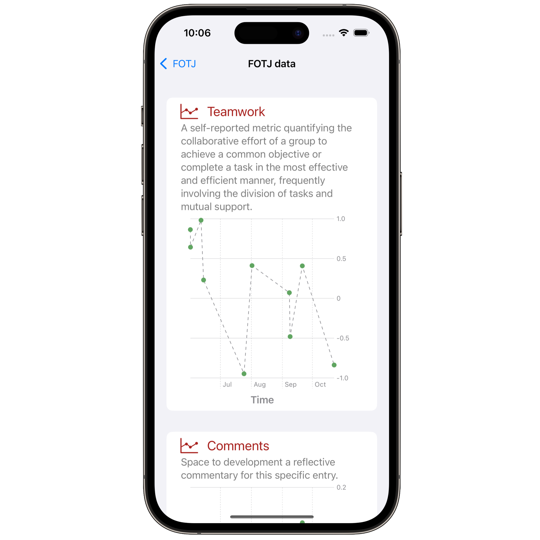
Summary data from each axis can be examined temporally and anonymously exported to see course-level trends as necessary.
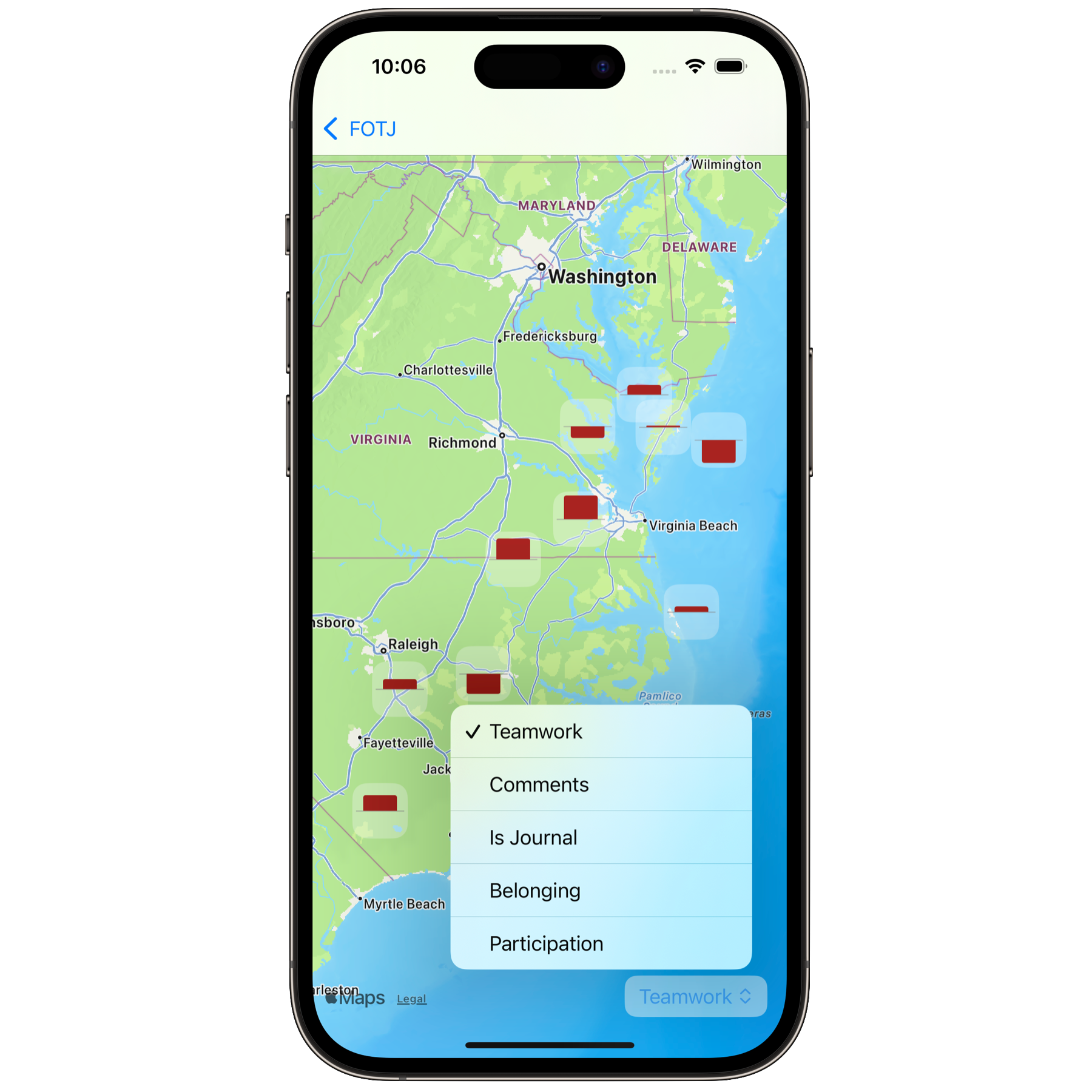
If the objective allows location data to be collected, each axis can also be examined spatially.
Current Status
This version has the following components:
- Develop an interface to define the objective.
- Configure it to add an arbitrary number of supporting assessment axes to the objective.
- Create a graphical visualization to view temporal trends in assessments.
- Create a map visualization to look at the spatial distribution of individual axes data (continuous, categorical, and semantic).
- Allow media insertion into the feed for the objective.
- Integrate AI to allow users to clean up all writing features.
RoadMap
The following versions outline the roadmap for the EcoConnect going forward.
Version 0.1: Off the Ground
Things left to do for version 0.1, scheduled for December, include:
- Specify an assessment graph, image, or other content as the static objective card header (currently, it is random).
- Extract data and location information from images and videos for mapping. It currently uses the time and location of the entry.
- Compress video streams and allow the import of existing video.
- Get the iPad layout appropriately configured. The iPad has a different UI/UX design and needs to be treated correctly (I looking at you, Instagram & Threads).
- Export entries for entire objectives as JSON & CSV.
- Add to TestFlight and push it out to get feedback during beta testing.
- Implement AppIntents for widgets on the home screen and Siri integration so we can connect to the Apple Intelligence ecosystem beyond just the writing aids already implemented.
Version 0.2: The Festival of Sharing
This version brings in sharing. The Objective should also be available as an immediate feedback mechanism. For example, an instructor may have a rubric for presentations and deploy the Objective and associated axes to all the students. Then, when each student presents, all the students should be able to provide feedback on the objective and have their assessment pushed back to the presenter (anonymously) for real-time feedback. This is scheduled for January 2025.
- Share objectives and axes as QR code and NFC, and collect responses for real-time feedback.
- Export the collection of reflections and data in PDF format for the course journal/archive.
- Configure all graphs/images to be shareable on social media as images.
Version 0.3: Mac Daddy
This version will expand to the desktop for more quantitative analysis of course-related objectives. It should be completed by the end of the first quarter of 2025.
- Create a MacOS version that does more quantitative analysis for journal/reflection and course-level quantitative data analytics.
Version 0.4: Textual Feeling
This version, targeted for summer 2025, would be the last development version before deployment.
- Change the writing interface to allow the insertion of media inline.
- Add rich text writing support (e.g., bold, underline, lists, etc.).
- Incorporate a sketch for the iPad and iOS version.
- Internationalization into languages other than English.
Develop an online learning course for individuals interested in deploying this tool in their courses. For broader impacts, this would most likely be done asynchronously via an online workshop site such as GumRoad.
